This features an array of work across User Research, Heuristics Evaluation, Data Gathering & Insights, Wireframing, Usability Testing & Validations Testing, and Key Takeaways.
Please Note: Due to NDA reasons, I am limited in the amount of information and data I can divulge on each section of this work.
Background
I joined Formplus at a time when they had no design structure and led the establishment of a design system, UX processes, and research approach. Formplus was built by a design agency and operated for three years before my joining. Most of the existing structure was engineering-focused with little to no accounting for user-centered design and maintained UX. I was tasked with product improvement and driving an increase in user conversion and retention. I had set out to understand the problem, define it, and see how it intersects with the company’s roadmap and goals for the coming quarters.
Goals & Objectives

Formplus had a good amount of site traffic, yet app usage was poor, user retention was low, marketing conversions were frustrating after free trials, and paying customers were downgrading to free plans due to a lack of satisfaction. For a Nigerian-owned Form creation service, Formplus had an opportunity to dominate the Nigerian and African markets, as there were not many players in this space. Sadly majority of the people still used Google Forms despite it’s limited features. For me to address the problems, I needed to set up data interpretation structures, understand the issues, and distill to the immediate needs. I approached problem research and data collection in 4 ways.
Product Heuristics
My work at Formplus entailed improving both the app features and marketing pages. I sort to identify which segment needed the most attention, hence, conducting an extensive heuristics evaluation on both segments. I used google analytics, QA reports and manual product review through user testing to identify how each segment performed against key heuristics parameters. I was able to identify that the app needed more attention than landing pages.

Google Analytics / Fullstory
I reviewed and compared key metrics like total users per session, duration, rage clicks, location, completed actions, total events, unique events, etc. For the purpose of this presentation, I mirror just four out of the other parameters. Digging deeper, the data showed how frustrating it is for users to complete a form creation process. This resulted in lack of interest to complete the formplus usage cycle of creating forms, sharing with their audience and collecting data.
Reviewed the data for July 2020 - August 2020 time period. We recorded 30k+ total events across Fullstory on the form builder. With 21k+ of this being rage clicks, 9k+ unique events, only 684 forms were created.

Intercom Feedback
Having collated insights from the fullstory analytics and documented the issues most pressing. I reviewed our 3rd data source - Intercom feedback. The information and data validated the insights from the fullstory analytiucs. Form builder and dashboard features were the most things they complained about. It was interesting to learn that the most issues bothering users were not bug fixes but key UX needs.
User Interviews and Survey
The research structure I established at Formplus was designed to understand the current condition of the app through heuristics, analytics tools, and customer feedback before engaging the customers. Over the years, I have come to learn that it’s more difficult to ask the right questions to customers during surveys and interviews if you don’t have a fair understanding/insight of what the current situation is. This final step in the data collection process was useful in our decisions during severity scoring of user needs.

With much information extracted from all the key data points, it was time to filter and distill the data to what matters. I involved stakeholders - the CEO, Product Manager, Lead Front-end Engineer, and the Lead Back-end Engineer. Due to Covid, most of the stakeholder engagements to filter research data was done online using Miro and Google spreadsheet. This process was approached through three (3) steps:
Affinity Mapping
I compiled the responses from the user surveys, interviews, intercom feedbacks and pieces from the full story analytics, I conducted affinity mapping with the stakeholders involved to synthesise the pain and challenges identified. We placed them on notes in Miro. We carried out card sorting and grouped these problems under common themes and issue types.

Analyzing Data
In this step, I applied the data-driven approach known as the severity framework to inform my process and list usability issues in order of criticality.

Prioritization
I recorded nearly 100 unique issues that we documented on Google spreadsheet after applying the severity framework. Next, I sorted and prioritized the needs based on severity and criticality to users tasks. Finally, I collaborated with the product and engineering managers to categorize the selected needs into broader epics and drafted them into sprint tickets. The task prioritization helped give visibility into the platform's critical areas that needed to be addressed from a usability standpoint. It also helped us align with the company's OKR and quarter goals for the year.

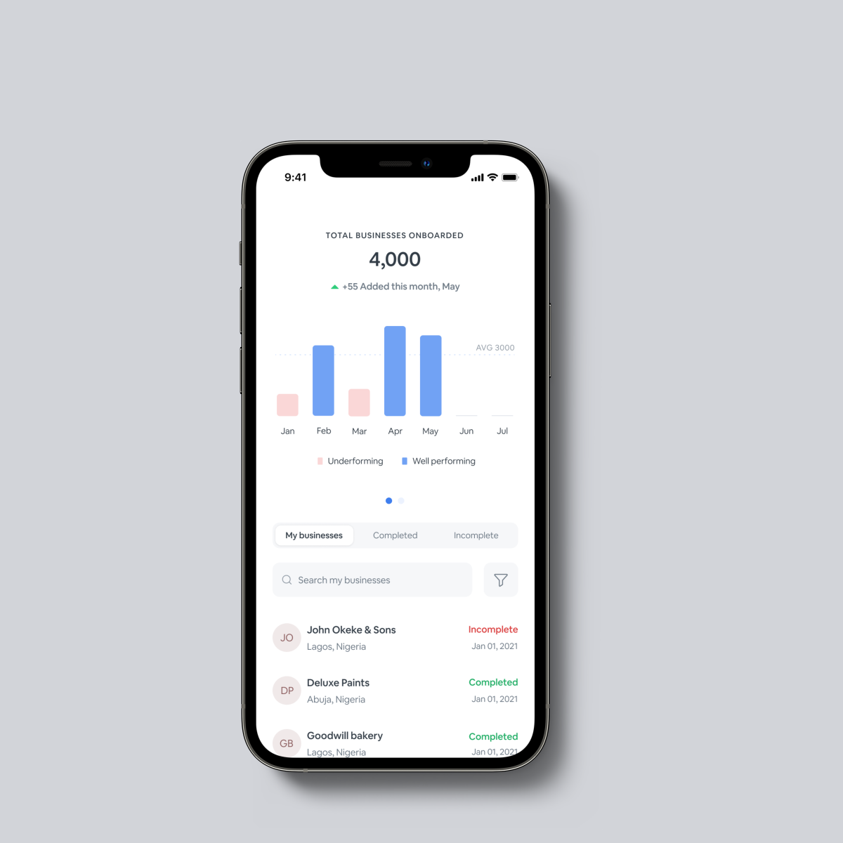
Dashboard UI & Layout
Users see no sidebar navigation. The main navigation is Dashboard, Forms, and Templates. This limits understanding of the app where key features and navigation are hidden. Reports and analytics are messy. The subscription plan card is less informative.

Overall Builder UX & UI
Visuals and Navigation bars are rigid. The field settings’ engagement actions are invasive and distracting. The customization, logic and overall settings of advanced field inputs were shallow limiting the possibilities of what users can build with Formplus.
Lengthy form builder steps
Users see 6 steps that impact their subconscious and limit their interests to proceed to build forms as they are either conversant users of google forms and other form services or new to form services. This influences 23% of user reduction in form creation.

Field Settings Menu Overflow.
When users interact with the field settings, the menu drawer overflows which limits user engagement with their form build as they cannot see what’s underneath. This increased form build ‘abandonment’ by 12% on our backend tracking. Full-story videos showed user pain points were high in this segment, as editing/setting long form fields was frustrating to users.

Reports and Analytics
Data tables are stretched out without prioritization of key information. Visual presentation of charts and graphs is unappealing, thereby limiting the usage of data images in user presentations. No option to export data images.

Social Links & Sharing
Users could only copy form links to share with their audience on social media. No extra settings were created for this feature to make social sharing more engaging.

File Management
Users could only see a long stash of forms on the dashboard with difficulty sorting through. They can only search or sort by date. This impacts how large organizations use Formplus as it is a mess to have all forms out and ungrouped. The bigger impact was that the more paying customers were individuals who use forms in bulk.

Date & Time Validation
Users could only set basic things like Time Format, 24 Hour Format, Date Format, Separator Type, Single or Multiple Dates, and Date Picking. No ability for extra customizations to the date and time field. This affected the usage of Formplus forms for variable time-based events such as booking appointments, school tests, etc.
Post-submission response
When audiences fill out the forms created by Formplus users, after submission the page only shows the form again with no response. This makes them fill out the forms again as they perceive it as a glitch. The impact is that this populates the data and reports with wrong numbers producing false data. Users feel frustrated when they learn their audiences resubmitted forms out of bad UX.
Get Help / User Guide
New Users don’t have a tour guide without navigating out of the app to read resources and watch tutorials on the marketing pages. This influences how welcomed a new user feels with the app. It can sway their decision to explore the app. This has contributed to about 9% of user drop-offs.
Having engaged with key stakeholders to define the top features in our prioritization, I had set out to sketching, and designing the lo-fi wireframes of these features. I validated the lo-fi wireframes through user testing. I prototyped and mocked up positions of the improvements on the app and had users to interact with it on the tool UserTesting.After validations and iterations of the lo-fi wireframes, I designed the hi-fi wireframes, prepared assets, and handed them off to the devs. Due to NDA reasons, showcasing the full scope of the design processes is limited. In this presentation, I focus on the hi-fi wireframes and impact post launch to highlight the key solutions created for each of the top prioritized UX needs.
Dashboard UI & Layout
The dashboard layout was remodeled to feature a common layout structure amongst SaaS dashboards. The goal was to follow the UX principle by Don’t Make Me Think by Steve Krug. I introduced the left-side navigation to give users an experience they are familiar with and know what and where to click without feeling lost and also closing the browser to start afresh. I improved the visuals to ensure the key cards and characters on the dashboard are as visible and engaging as possible. Users can see better reports and analytics tables, charts, and graphs. There is also an improved user plan card that details the quota usage and availability, helping users track their subscription usage.

File Management
Large organizations and bulk form users have the option to manage their files better. The dashboard now features a file management navigation page. Users can shelve forms into folders and label them accordingly.

Get Help / User Guide
A 5-step product tour for new users to engage with before using the form builder. This was created by animating page interactions that take a user from a blank canvas to a created form ready to be shared.

Reports and Analytics
I redesigned the data table to highlight key items submission ID, date, response, duration, location, and device. The initial table placed form fields as column headers which stretches out the table as fields like short text and long text contain variable contents which make the table to be hard to skim through. Hence defeating the point of table usage in data representation. With the new table, the content is fixed and not stretched out. Through the responses column, users can see filled or partially filled forms. Filled responses are represented in bits using charts, graphs, and lists where necessary.

Social Links and Sharing
I redesigned this feature to allow users to customize social sharing settings in these ways:

Post-submission response
To combat data duplicates and wrong info submissions, I created a post-submission page that shows up after a user submits a response. Users have the option This serves as an extra marketing option for Formplus. Users have the option to also customize the post-submission response page through such ways as setting the option to submit a new response or print the submitted response. Premium users can customize page colors, and messages, or place marketing content on it.

Feedback Card
This feature is focused on locking in on user feedback and constantly learning their frustrations to keep on with the goal of establishing a data-driven design. The feedback back ensured CX improvements are influential in product roadmap quarterly OKRs. Formplus had struggled for a while to keep up-to-date with user feedback without always requesting interviews and surveys. After my product analysis of leading B2Bs, I learned it would be key to place a feedback card right at the end of the form build process, on the share page. The psychology of UX at play here was that when users complete a form creation, they are either frustrated, happy, or neutral. That would be the perfect time for them to share their experience with the builder.

Form Performance Report
In SaaS products focused on helping businesses produce and record data, reporting is crucial and never overwhelming (unless otherwise reported by users). Taking inspiration from Grammarly in its approach to customer engagement, activity/data reporting plays a key role in user motivation and retention. I created performance reporting via email with the growth/marketing team. At the end of the month, users will get a report of how well their forms performed and the location spread of their audiences.

Fewer forms were abandoned and we observed more users completed their form builds. This was relevant in reducing frustrations and rage clicks, thereby increasing user retention rates.
Increased usage of Formplus for appointment bookings, and usage in education settings by universities and schools to schedule submissions and tests.
Reduced form creation drop-offs, and greatly improved retention rates of new users by 300% based on Full story reports and user surveys.
Repositioned Formplus to more than just form services, into a no-code tool for professionals and businesses. With the improved payment and integration feature I designed, there was a record increase in e-commerce use cases. People built swift simple e-commerce stores and collected payments.
Increased Formplus usage by large organizations. We recorded more sign-ups and premium subscriptions post free trial and demos.
We recorded a spike in link shares from an average of 500 link shares per month to 3200 shares per month via google analytics. We learned that most businesses and individuals creating survey forms have no distinct audience source, so social platforms are ideally their first go-to place to gather data.
Overall, the dashboard and form builder redesign a great significance to the role of data-driven design approach in product building. Most of the user blockers and poor rates of user retention were due to bad UX. I was able to flip this around during my time at Formplus. Grew monthly active users from 5k to 12k, and established a data interpretation funnel that connects all data sources into actionable insights.
Summary & Takeaway